
Simple controls help players understand what is happening, react without hesitation, and avoid mistakes caused by crowded screens.
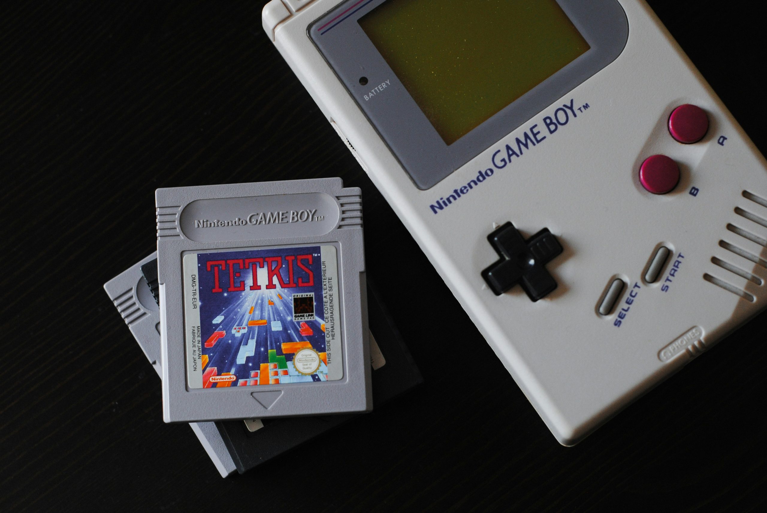
Retro games proved this decades ago with directional pads and a few action buttons. Mobile casino games face a similar challenge because they must fit betting controls, balances, rules, and animation onto a small touchscreen.

That challenge becomes more important when money is involved. When looking for a suitable platform, many players compare licensing details, test the mobile interface, or check out this guide before choosing where to play.
A clean layout helps them see the stake, confirm the selected value, and recognize which action will start a paid round.
Limited Controls Create Clear Decisions
Many early console games used a directional pad, Start, Select, and two action buttons. The Nintendo Entertainment System controller is a clear example.
Developers could not rely on long tutorials or layered menus, so each input needed a distinct purpose. In Super Mario Bros., the player mainly moves, jumps, and runs through those basic actions.
That simplicity doesn’t make the game easy. A small control set lets developers place difficulty in timing, level design, enemy patterns, and resource management. Players learn the inputs quickly, then focus on the real challenge.
Mobile casino games use the same principle. A slot usually needs a stake selector, spin button, paytable, and settings menu.
Blackjack needs clear buttons for hit, stand, double, and split when available. Adding more controls to the main screen can increase accidental taps.
Core Controls Should Answer Three Questions
A useful game screen should make these points obvious:
- What action can the player take now?
- How much money or credit will it use?
- What changed after the action was completed?
Touchscreens Need More Space and Feedback
Physical controllers provide tactile feedback, so players can feel button edges without watching their hands.
A phone screen has no physical boundaries between controls. The interface must replace that feedback with size, spacing, animation, and sound.
Apple recommends that frequently used game controls measure at least 44 by 44 points. WCAG 2.2 sets a minimum pointer target of 24 by 24 CSS pixels, with limited exceptions. Both standards recognize that small targets are harder to activate accurately.
Mobile designers should avoid placing the spin button beside stake controls. Retro emulators need enough separation between movement, jump, attack, Start, and menu buttons. Frequently used actions should remain within comfortable thumb reach.
Useful feedback can include:
- A visible pressed button state
- A brief vibration on supported devices
- An immediate balance or score update
- A clear message when an action is unavailable
Feedback should confirm the input without covering the game. Long animations and oversized popups can make controls feel slow.
Simplicity Supports Accessibility and Safer Play
Clear controls help people with limited dexterity, reduced vision, or less mobile experience. Larger buttons reduce precision demands. High-contrast labels make actions easier to identify. Consistent placement also helps players build reliable habits.
Casino interfaces carry extra responsibility because control errors can have financial consequences. The stake should remain visible before a round begins.
Currency conversions should also be clear when a platform displays dollars, cryptocurrency, credits, or tokens. A simple interface should never hide important information merely to look cleaner.
Responsible play tools must also be easy to find. Deposit limits, time reminders, session history, and self-exclusion controls should not sit behind vague menu icons. Simplicity works best when it reduces confusion while preserving informed decisions.
Consistent Controls Reduce Costly Mistakes
Simple controls become more useful when they stay in the same place across different screens and devices. A player should not have to search for the spin, pause, jump, or menu button after rotating a phone or reopening a game.
Retro games created strong control habits because the same buttons usually performed the same actions throughout the experience.
Mobile games should follow that pattern. Moving the stake selector after every round or changing the location of a main action button can cause hesitation and accidental taps.
Consistency also matters during network delays. A casino game should temporarily disable the spin button after a request has been sent, then show whether the round was accepted. Without that response, a player may tap again and believe two bets were placed by mistake.
Developers can reduce these problems through:
- Fixed positions for primary controls
- Clear disabled and active button states
- Protection against repeated taps
- Immediate confirmation after each input
Simple Controls Leave More Room for the Game
Retro games show that a small number of inputs can support demanding play. Mobile casino games show why those inputs must also communicate cost, status, and results precisely. Strong controls disappear into the experience because players rarely need to interpret them.
The best design is easy to learn, difficult to misuse, and consistent across devices. That approach improves accessibility, reduces input errors, and gives players more attention for the game. For businesses, it also supports clearer compliance, stronger testing, and a more defensible insurance risk profile.